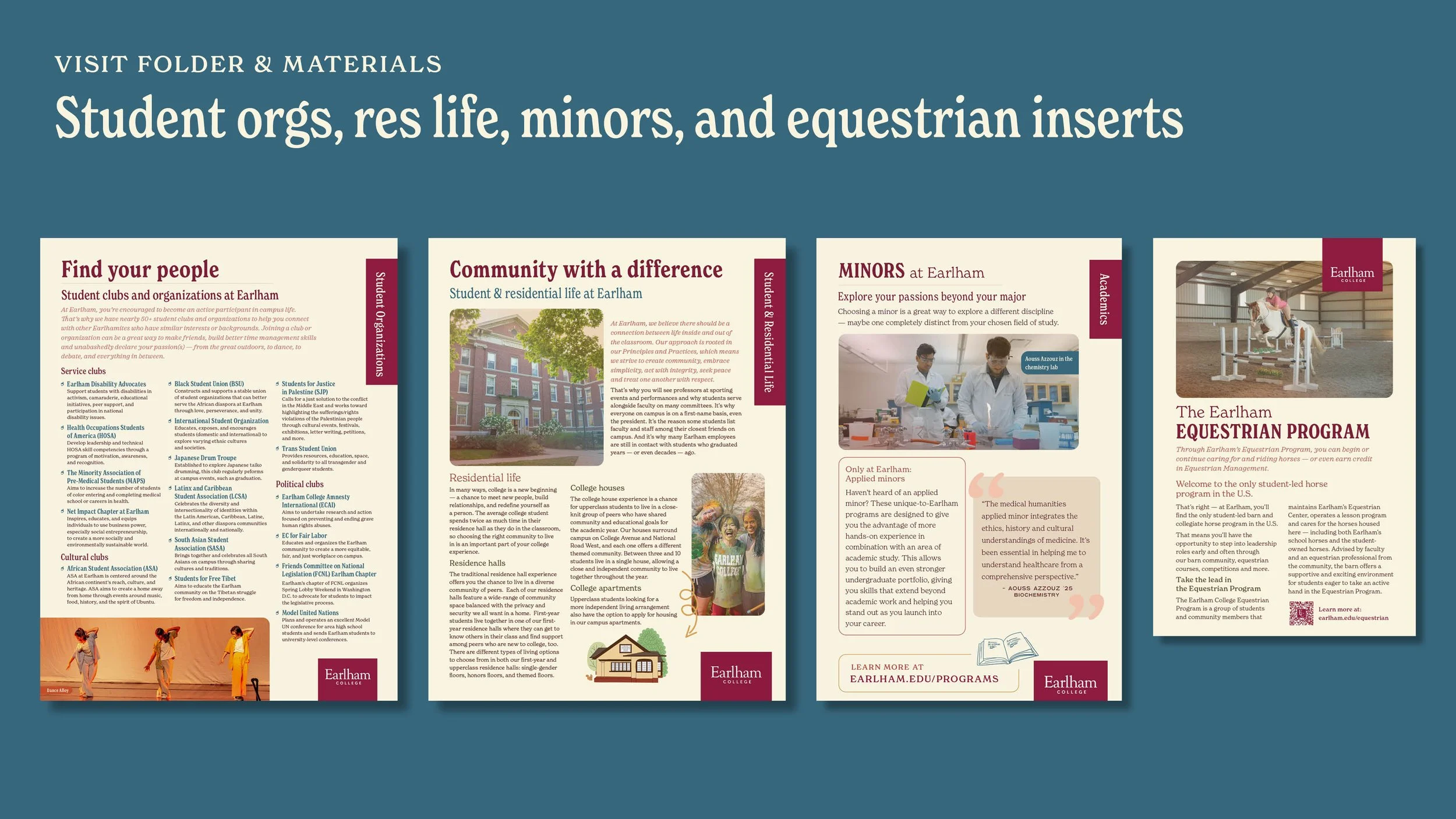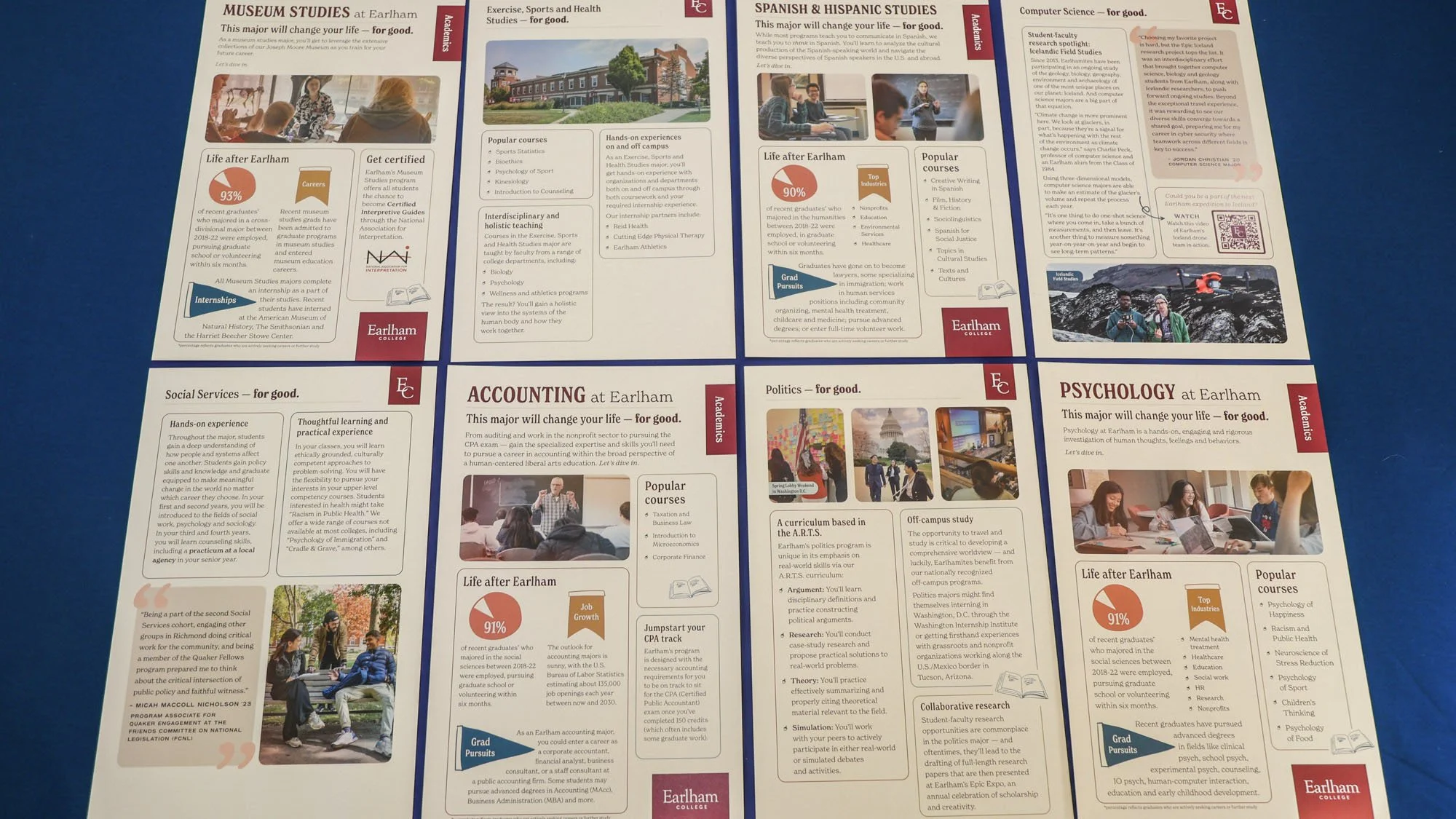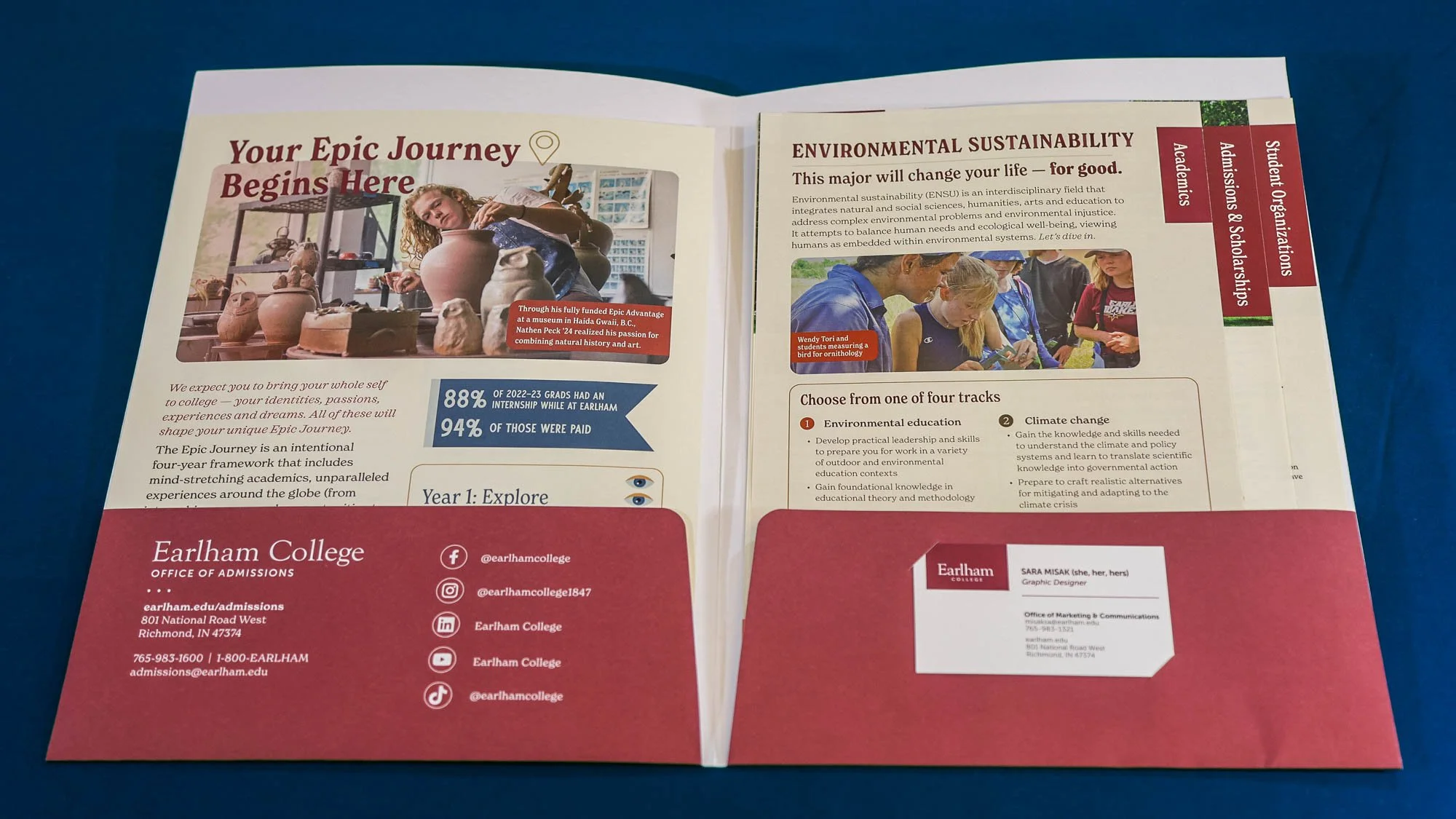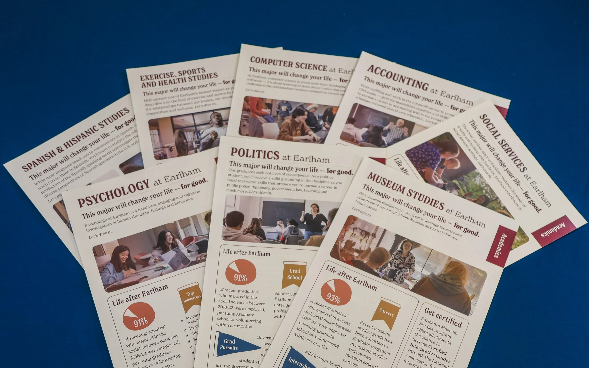
Admissions folder redesign
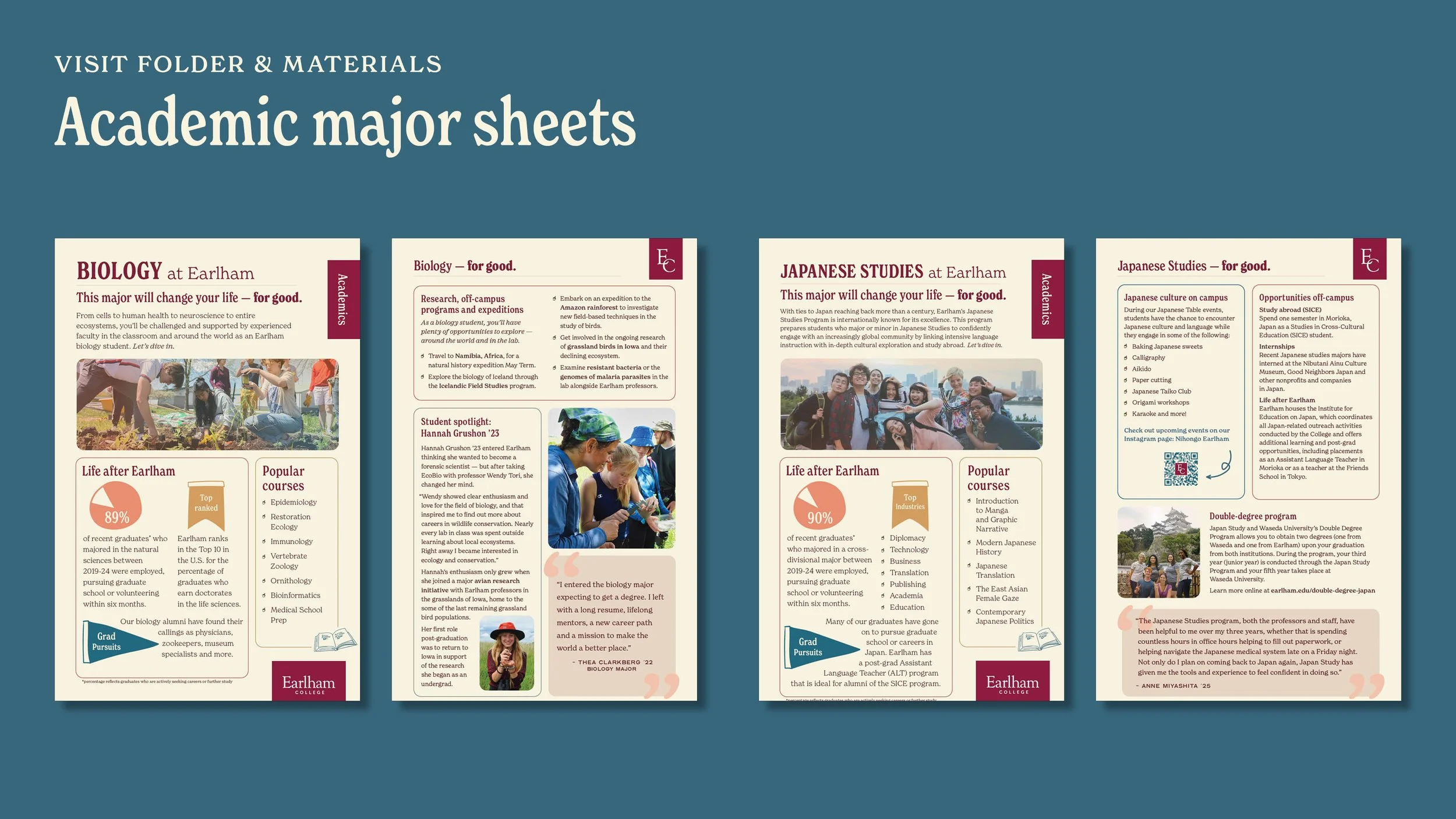
The goal of the Admissions folder redesign was to find a way to highlight the best features of each academic major, allowing fluidity for sections. I designed a modular layout that was easily adapted to each major. Working from sketches through design iterations, we arrived at a sheet layout that could be quickly scanned by prospective students and their parents to find information and answer questions about a major. The design also incorporated the brand refresh, which brought more variety of colors and a characteristic serif font. Lastly, the photography needed a filter for the sheet to look unified. To tone down the sharpness of the photos, I developed a custom filter that was applied to each photo. The result was a cohesive, informative, and brand-aligned look, further enforcing Earlham's unique academic opportunities.
Sketches of modular layouts